About the project
AMK-Electro company makes electrical equipment based on both standardized and individual designs. For many years, the Company had a website which was essentially an interactive product catalog. However, since the initial launch of their website, technology made quite a huge leap forward, and the Company realized they need to keep their website in touch with our day and age.
I have been supporting the old website for some time, which previous developer left to the Company. Eventually it became apparent that the website needs complete redesign both on frontend and backend side, so I took this opportunity and made a new one from scratch, with responsive features and mobile platform support.
Requirements
The main requirement from the Company was to make website responsive, yet keep it recognizable on desktop platforms. Most users of their website are returning visitors, and the Company doesn’t want to lose them. I needed to make sure that transition from the old to the new website is as smooth as possible for the users, so that they don’t need to relearn how to use the website.
This means that hierarchical structure and general layout should be preserved.
Header
I started from something that was obvious from the very beginning - I got rid of the visual noise.
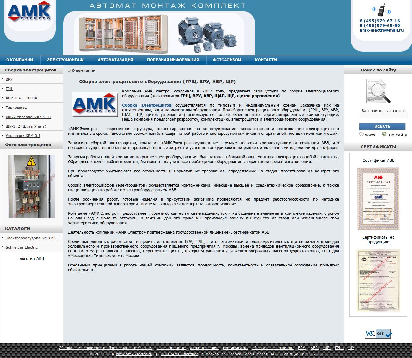
The old developer left many elements which didn’t play any functional role - the most prominent example is the header. I removed all the pseudo-decorative elements which were stealing users’ attention. They didn’t have any value for the customer, and keeping them “as is” on mobile platforms proved to be unnecessarily hard.
I also removed a photo which was right in the center of the header. I thus solved two problems at once - freed the user from all the visual clutter while making website look much cleaner and more impressive on mobile platforms. Any kind of imagery in the header takes a lot of space on cell phones, and also wastes quite some traffic (always save traffic for your users!).
Navigation
The old website had two side panels - left one and right one. The left panel contained product catalog; this menu played an important navigational role. Both panels contain photos of products and scans of company certificates, but having these on every page is very distracting. Trying to fit both side panels on mobile platforms is highly impractical, so I got rid of the right panel and moved certificates to a dedicated page - they definitely deserved this.
The old website featured a photo album page with product photos, but I decided to remove it. I think that a page dedicated entirely to picture galleries is an atavism from the past. If you have some media content which you want to share with your users, place it on a relevant page where it will bring value to the user. In particular, every product page from AMK-Electro catalog is already supplied with photos, so duplicating them in yet another place would be pointless.
These improvements alone made website much easier to digest.
Magic of the double menu
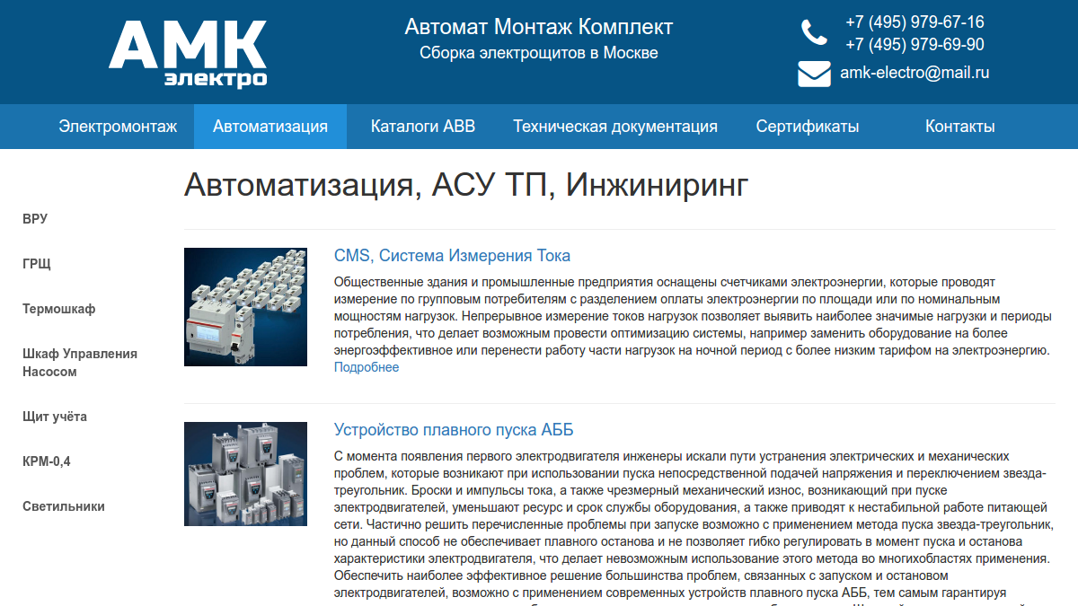
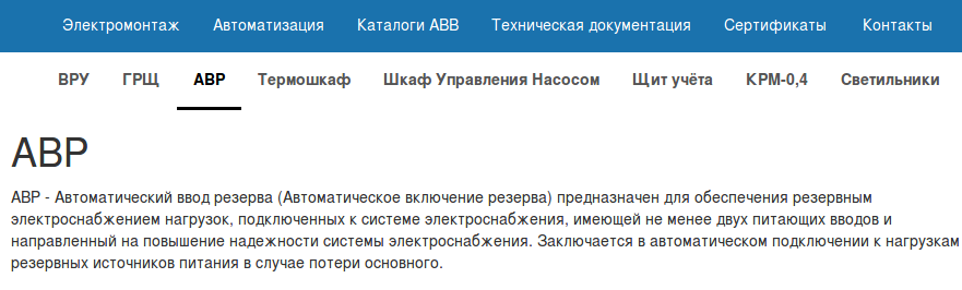
The original website had two menus: horizontal main menu (leading to informational pages) and vertical side menu (linking to product categories). Both these menus are the most recognizable elements of the website, and getting rid of them was not an option. On desktops, they should be kept “as is”. On mobile platforms, they may look different, but they need to be convenient to use.
The old website was designed as nested HTML-tables - this is the simplest rock-solid solution from the 90s and early 2000s, but this kind of design doesn’t look nice on mobile platforms. Bringing the old solution back was not a good idea.
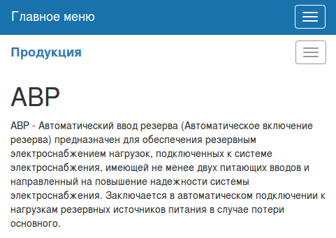
I made this website responsive with Bootstrap CSS framework. This framework doesn’t have an “out of the box” solution for this particular problem, and the 3rd-party solutions didn’t satisfy me in terms of reliability, so I wrote my own logic for the side menu. As a result, website layout on desktops has a striking resemblance to the original layout, and on smaller screens these menus are automatically converted to horizontal menus; when browsing on a cell phone, the menu is hidden behind the burger button to save space.
Styling
I picked easy-to-read fonts for the website to make it readable on any kind of device. Company colors were preserved, and only some hue alterations were made. I made sure that all pages of the website are neatly rendered on mobile platforms.
Search engines approved my effort and marked the new AMK-Electro website as mobile friendly - mission complete!
Admin page
The old developer didn’t provide an admin page that would allow administrators to edit website content, thus all content alterations required programmer’s involvement.
I like to make life easier for my clients, so I designed a lovely admin page which allows to edit any information on the website, so that AMK-Electro don’t have to ask for my help every time they need to update content. Website became much simpler not only for its clients, but for the Company itself!
To demonstrate viability of the admin panel to AMK-Electro, I reconstructed the original website structure and filled it with content using only the admin panel. AMK-Electro appreciated my effort, and now they use all these new features to continue improving their website - and their business as well.
If you like my portfolio and you would like to hire me for your project, feel free to contact me!