Back Story
Smile English School contacted me when they already had a website built by another company. Soon after their original website was built, the developer company mysteriously disappeared, while the school wanted to keep improving their website. The School asked me for help, and so I started supporting the old website and introducing new features to it.
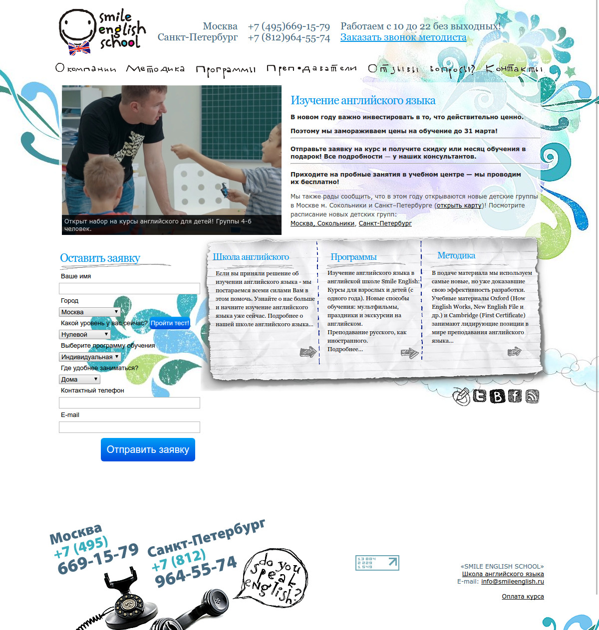
Eventually it became obvious that it’s time to say goodbye to the old website. Many of its pages were riddled with visual noise, page hierarchy sometimes seemed illogical, the website was not adapted for mobile platforms, and many design solutions made by the previous team were questionable.
And so Smile English School asked me to redo the whole website from scratch.
Website structure
The old website had a number of navigation problems. For instance, to browse courses for adults or for children, one had to go down to the third level of page hierarchy.
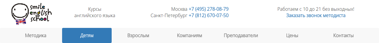
Some visitors couldn’t make it - they would usually get lost in other sections of the website. For that reason, I moved “For Adults” and “For Kids” pages one level up and made them available from the main menu, to make them accessible in one click.
I decided to make header as light as possible. Header contains only some general information, phone numbers and “request a callback” link.
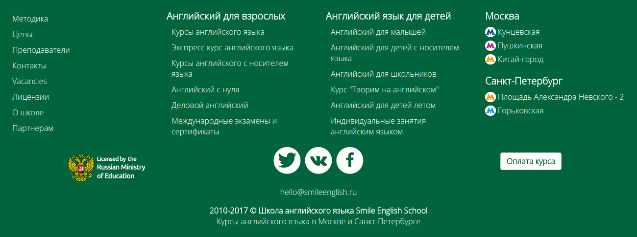
The footer was also redesigned from scratch. I filled it with the most important internal links, as well as links to social networks.
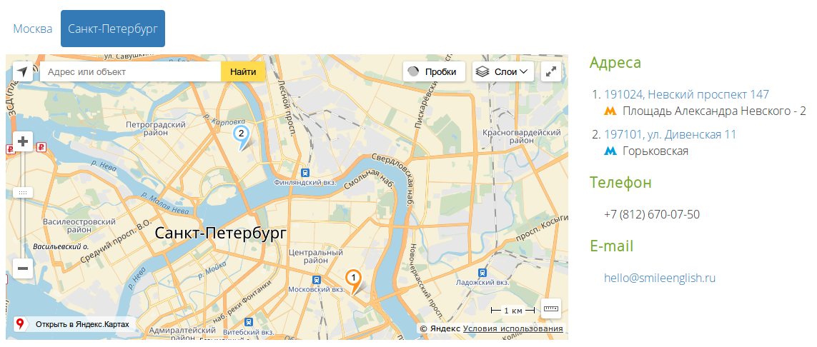
Aside from that, it has another important function for School clients: it contains School’s office addresses. Each address is a link that leads to a full description of the office.
You can easily reach “Contact us” section from there, which has an interactive map with all the important info neatly organized on a single page.
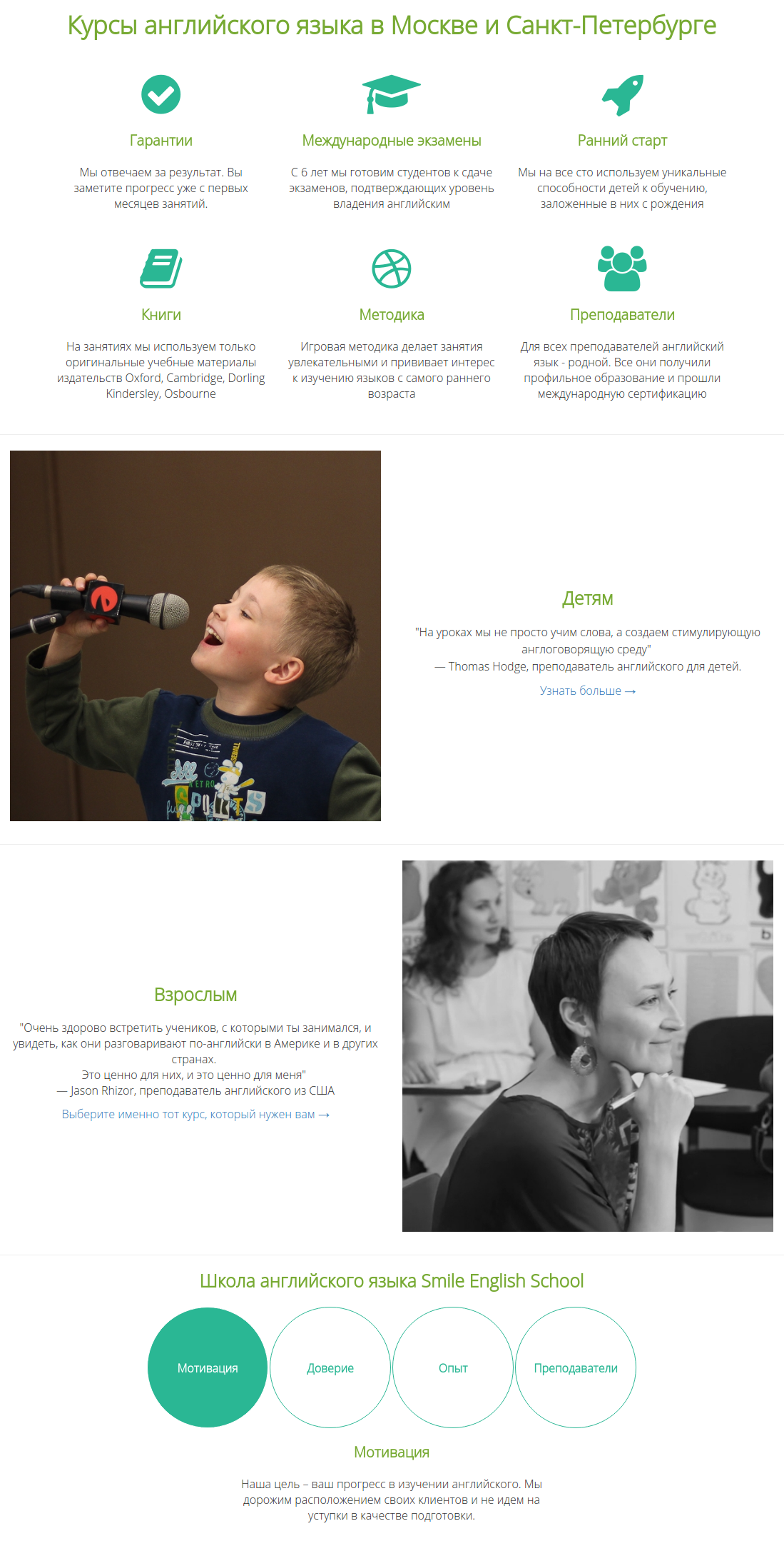
Home Page
Home page is styled as a classic landing page. Icons, eye-catching photos and short yet powerful texts attract new customers by explaining the advantages of studying at Smile English School. The website became more intuitive and user-friendly for new visitors.
Course Pages
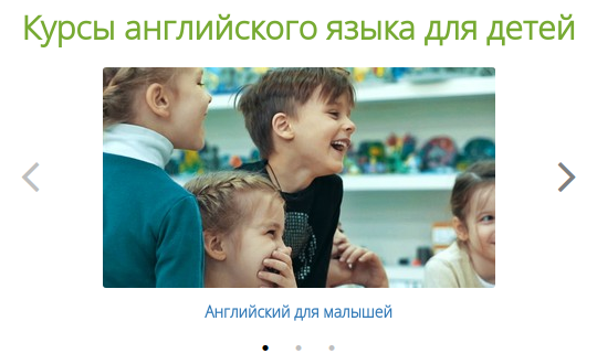
Smile English School offers a wide spectrum of educational courses for adults and children. I wanted to make the list of courses both informative and entertaining. That’s why I implemented navigation on pages “For Adults” and “For kids” as a combination of carousels and tabs, which allowed me to make it more lively and to prevent it from bloating vertically.
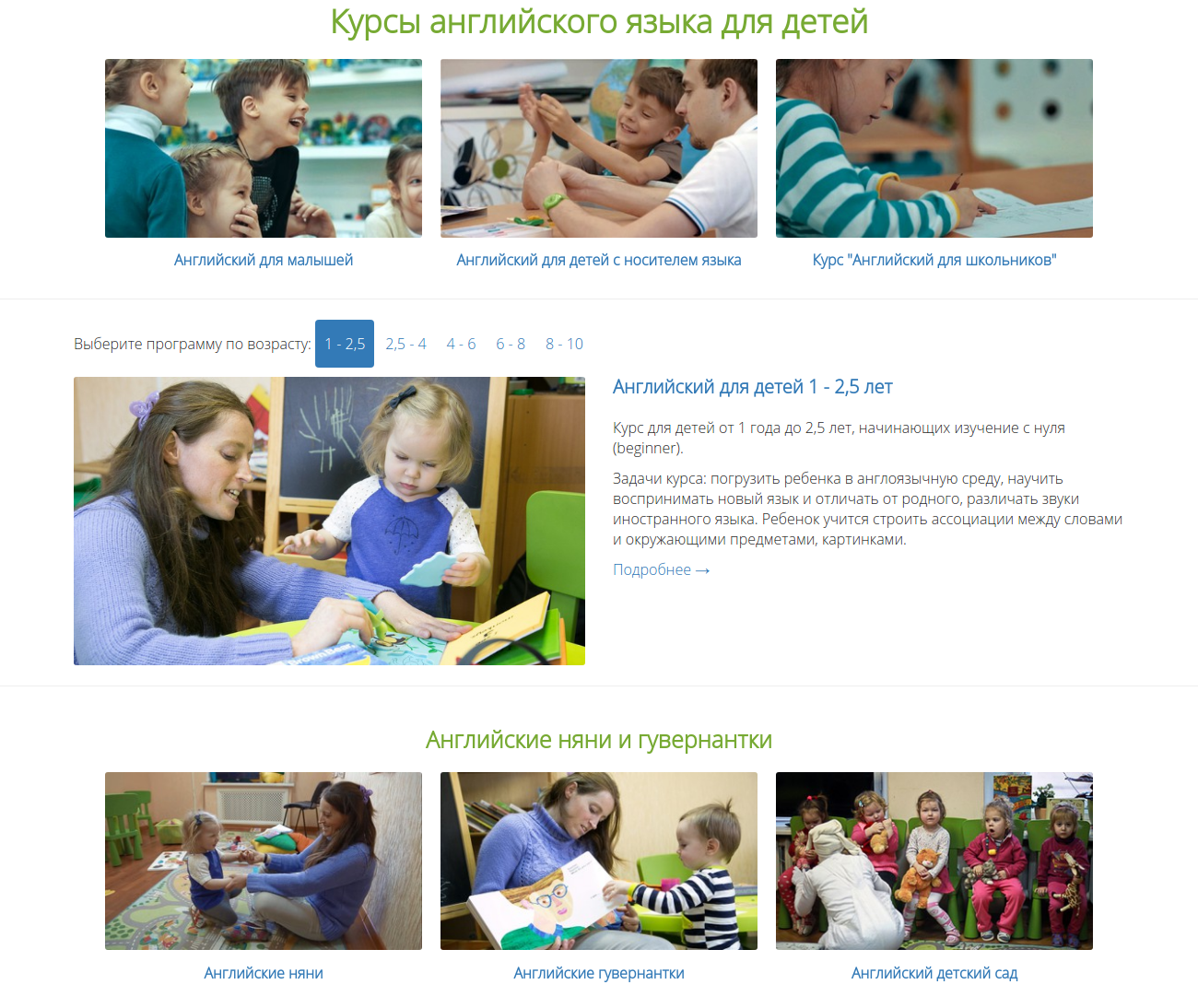
The main advantage of this navigational solution is that it scales automatically depending on device size. For example, if you visit the course page from a laptop, the three main courses will be rendered as a single horizontal row. However, all of these three courses wouldn’t fit on smaller screens, hence the row automatically turns into a carousel, which you can scroll by swiping, dragging with mouse, or by clicking arrows on its sides.
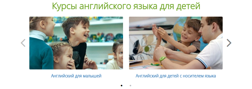
The smaller the device is, the more compact the carousel becomes.
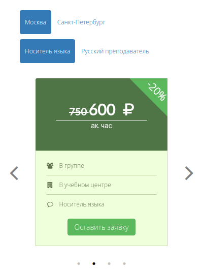
Pricing page
I applied a similar solution for pricing page. User can filter which particular courses they are interested in.
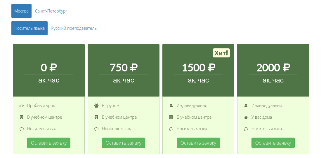
If user visits this page from a cell phone, the price container will automatically turn into a carousel.
Responsive web design
Examples above demonstrate which technical solutions allow the websites I created to look great on any device. I make all my websites responsive, which makes them both visually attractive and convenient to use on desktops, tablets, cell phones and any other devices.
Styling
The old website was full of ginormous side panels, crazy pop-up elements and other examples of bad design. I got rid of all the noisy elements and made the website light and radiant. I chose fonts that are comfortable to read on any kind of device.
Technology integration
I implemented a number of integrations with various web services which are essential for business: ol
- Client applications are sent to a CRM system over its API, to make School’s managers’ lives easier
- Users can sign up for newsletter
- Users can pay for their courses using website (via an integration with Yandex.Money service)
- All phone calls from clients go through a virtual phone station, which registers all calls in a CRM system and routes them to School managers
If you like my portfolio and you would like to hire me for your project, feel free to contact me!